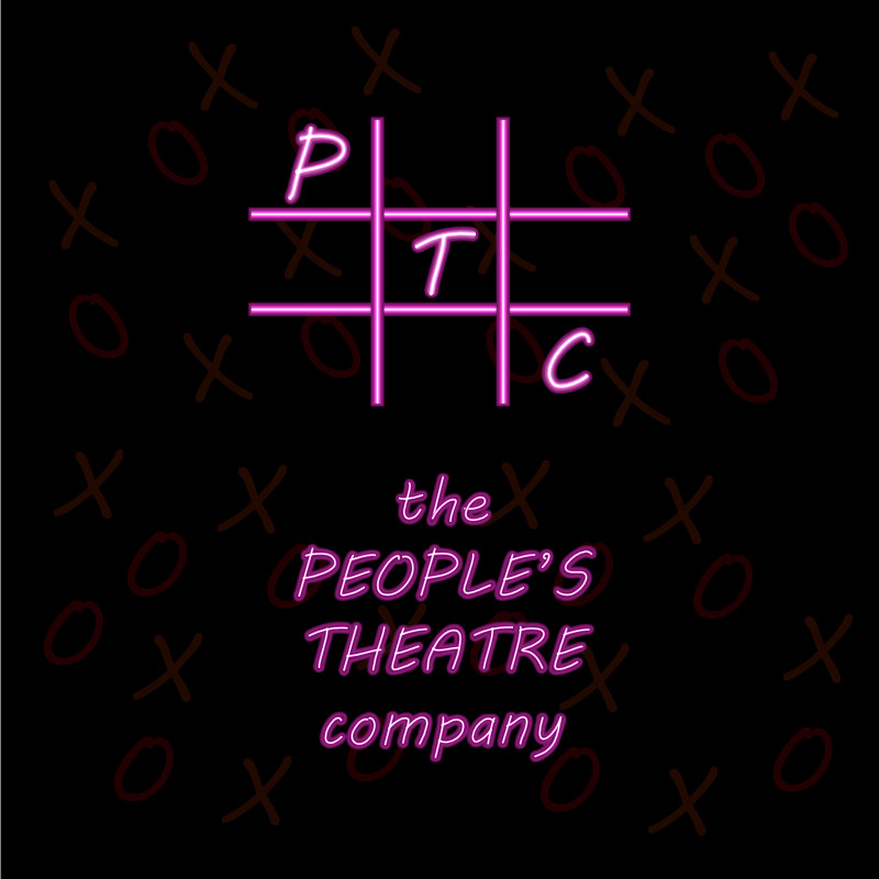
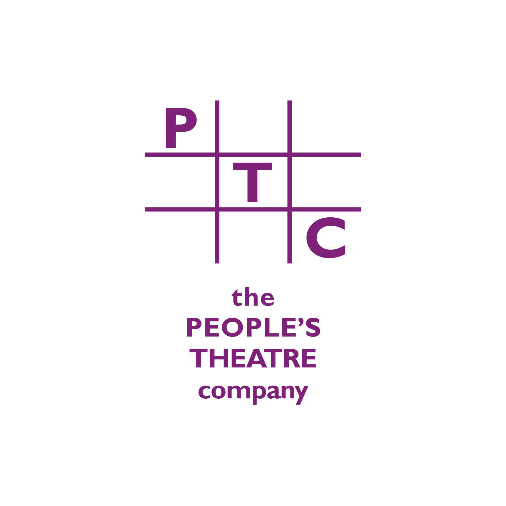
Tasked with creating logos that would speak to both children & adult theatre goers, I had to keep the noughts & crosses frame & concept, as well as the purple colour.
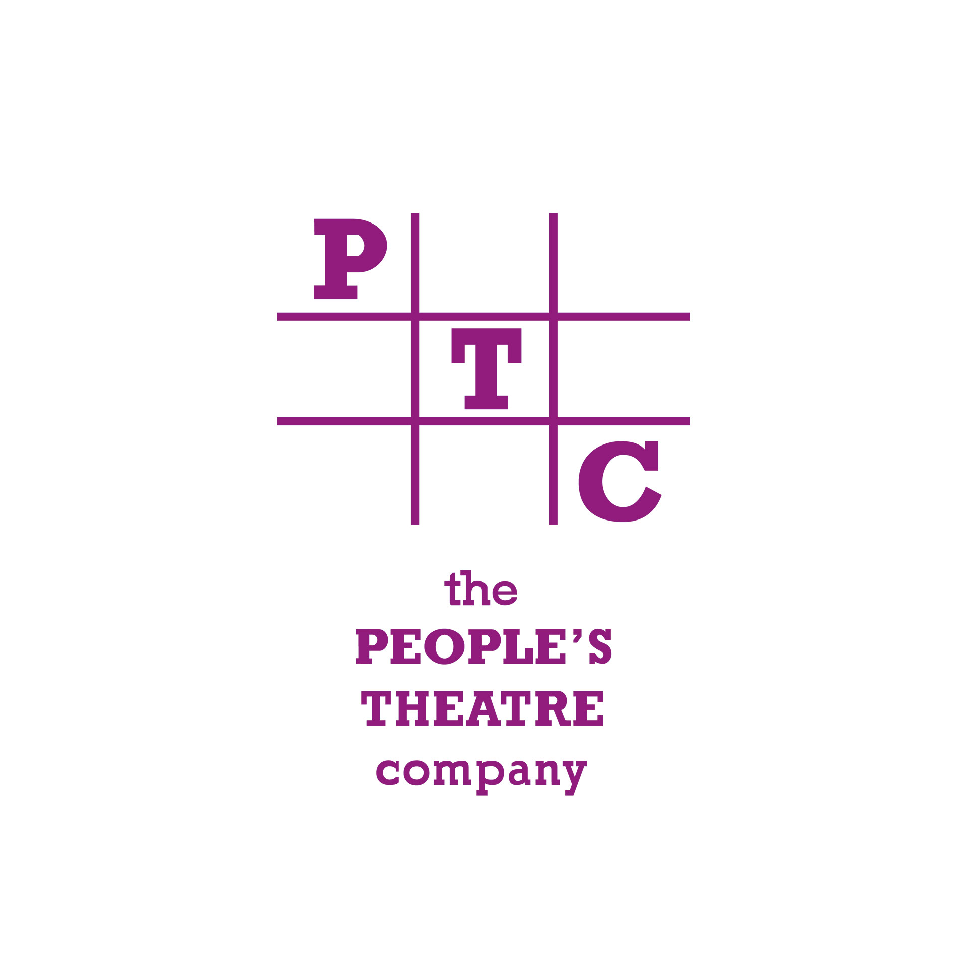
Above is the original logo I was asked to vectorize. I was also asked to create variations of the logo, softer, harder & playful. I was also asked to create another logo of my choice, free hand in design.
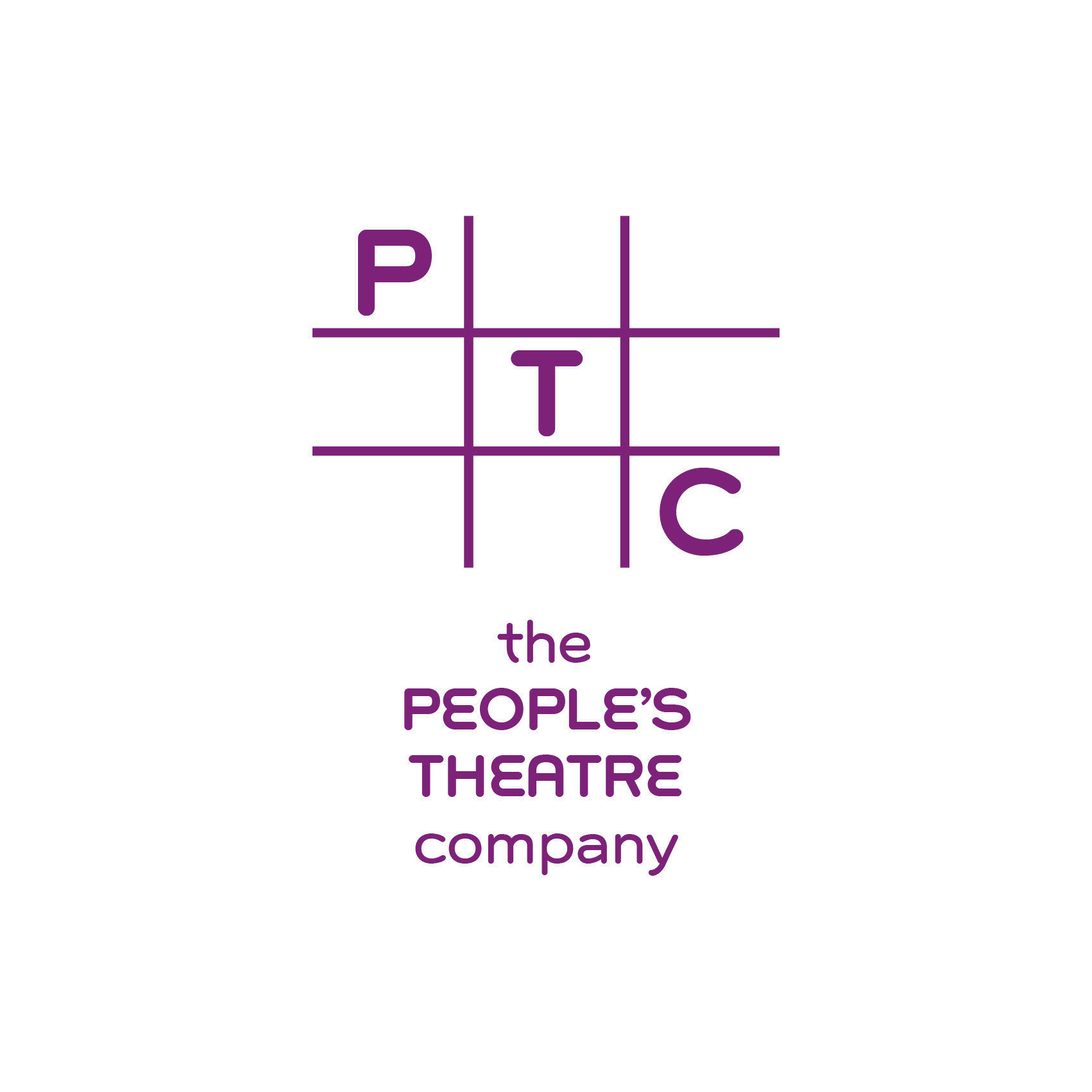
Here above is the softer version
This one above is the harder version.
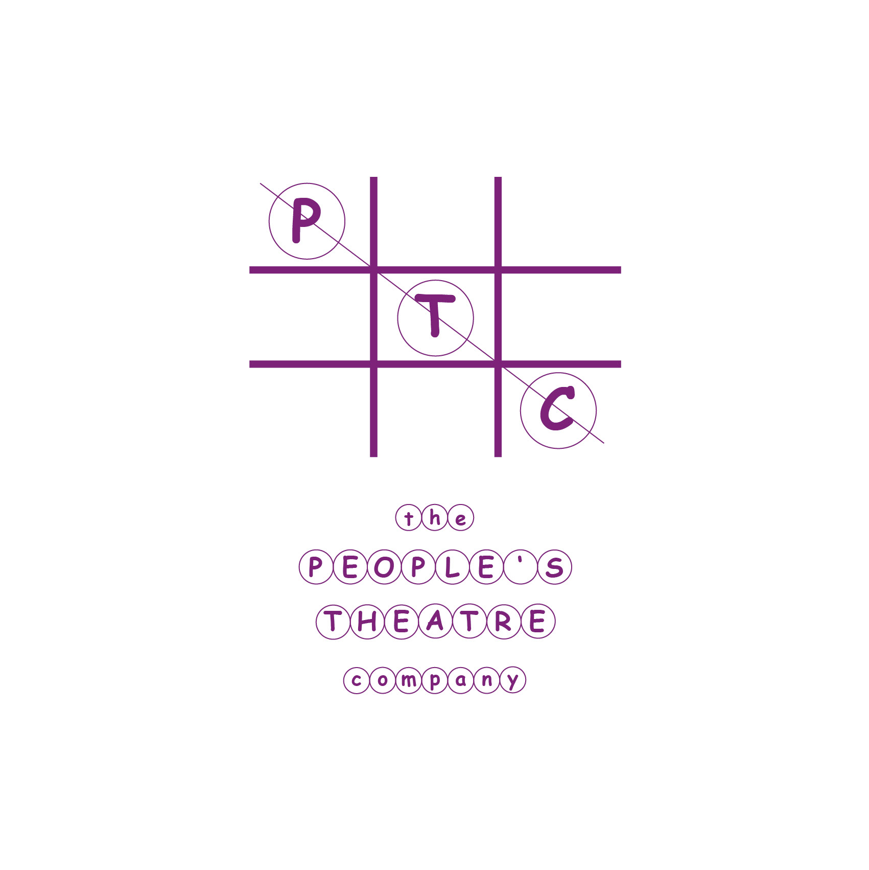
I went more into the noughts and crosses theme with this playful version above.
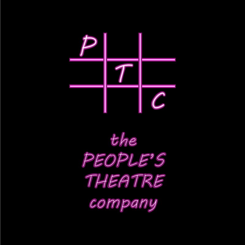
These logos, both above & below, are my free hand designed logos. I felt with all the predominantly bright white versions a nighttime version, based on the neon lights theme of the theatre world, combined with the structure & colour requirements.